LIMEN, PRINTER
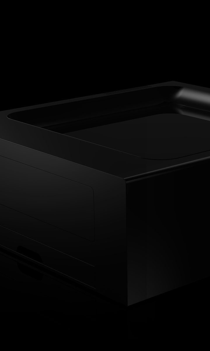
LIMEN, PRINTER

Project Brief & Exploration
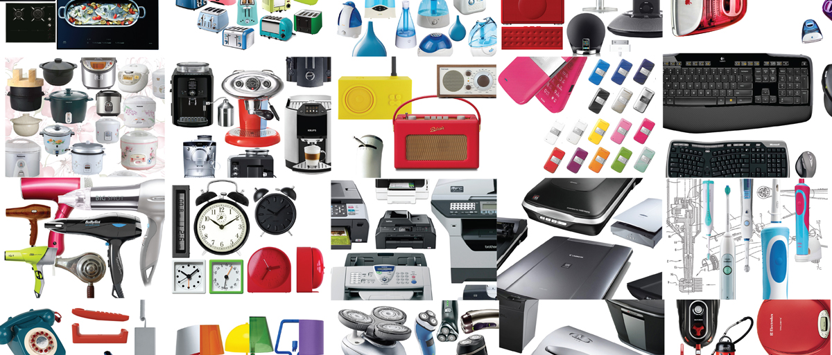
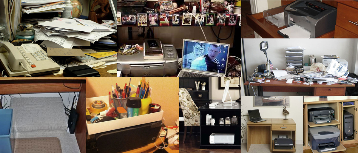
How people respond to these emotionless designs
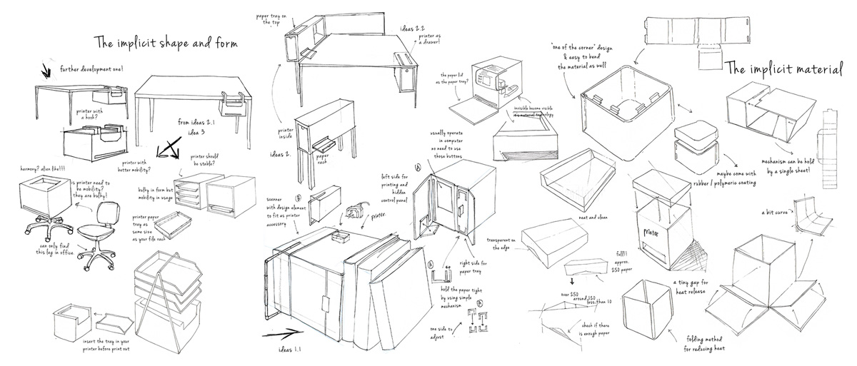
I chose a laser printer to be redesigned because many people are dissatisfied with the size and styling of them.
The internal mechanism/hardware of a laser printer occupies a certain amount of space; hence the bulky/ boxy appearance has become the norm.
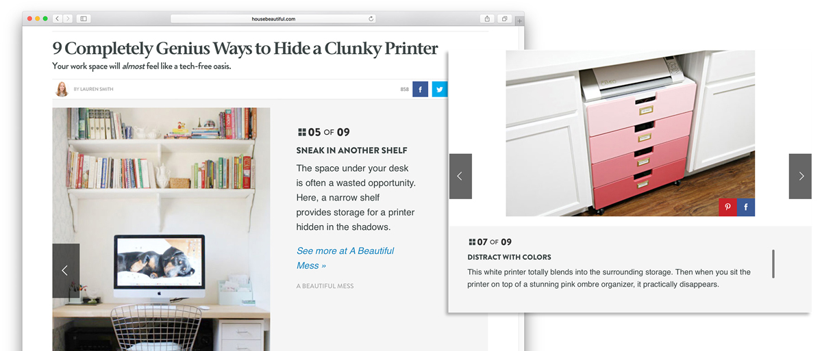
Hide your printer
People are dissatisfied with the size and styling of today’s laser printers because of their already limited space at home.
As a result, people perceive a printer as a secondary product and choose to keep them ‘hidden’ when possible.
Product Design

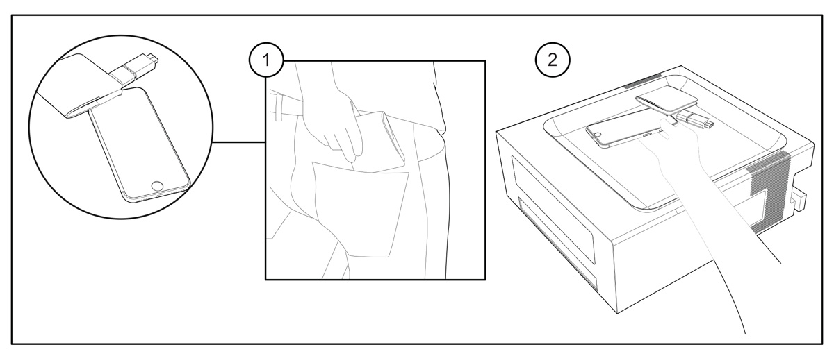
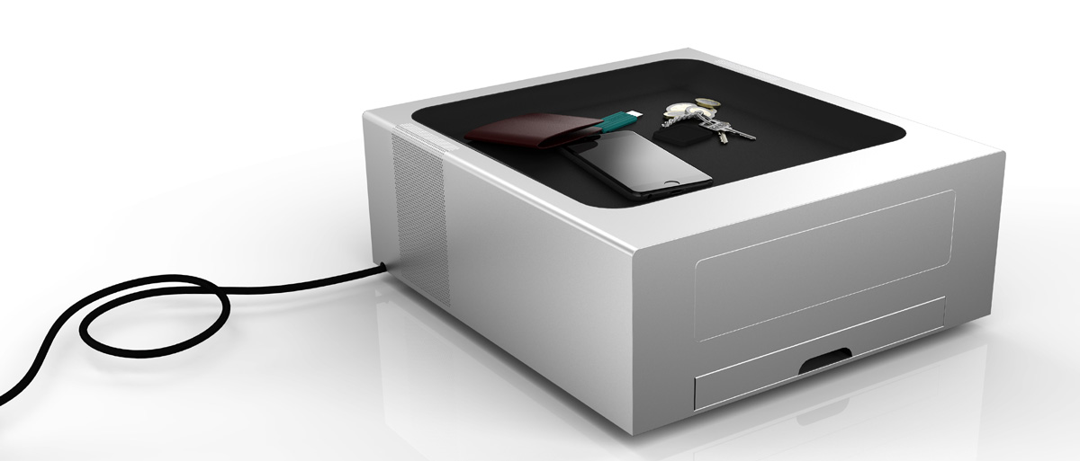
User scenario 1: A recessed surface to carry your key items
The top surface is a subtle rubbery tray-ideally shaped for placing keys, mobile devices, and other small pieces that would otherwise get in the way of work.
Step 1: The personal gadgets and everyday items that people have on them.
Step 2: The rubberized recessed surface acts as a placeholder for all your small items when back at home on your desk.
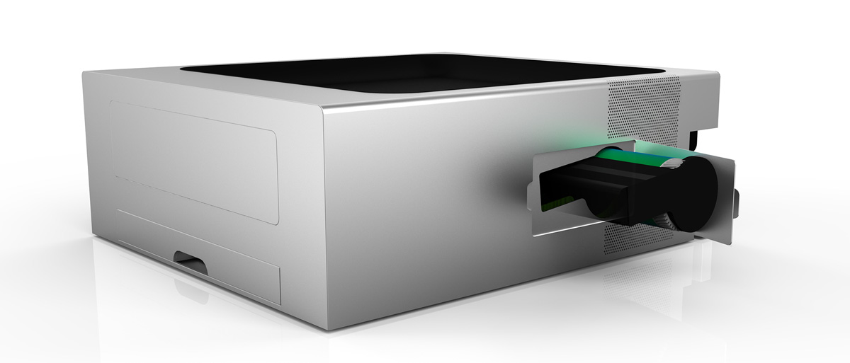
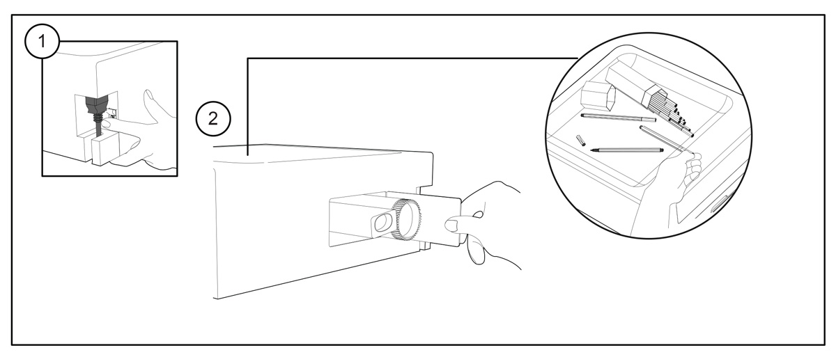
User scenario 2: Another way to refill your toner
The design had to incorporate a new way to change the toner without lifting or moving the top of the unit, (as this would require the tray to be cleared). Therefore the internal hardware was rearranged to ensure the toner could be changed from the side, leaving the tray area undisturbed.
Step 1: Switch the power off.
Step 2: Open the lid where the right side of the printer and simply pull out the toner and refill with a new one.
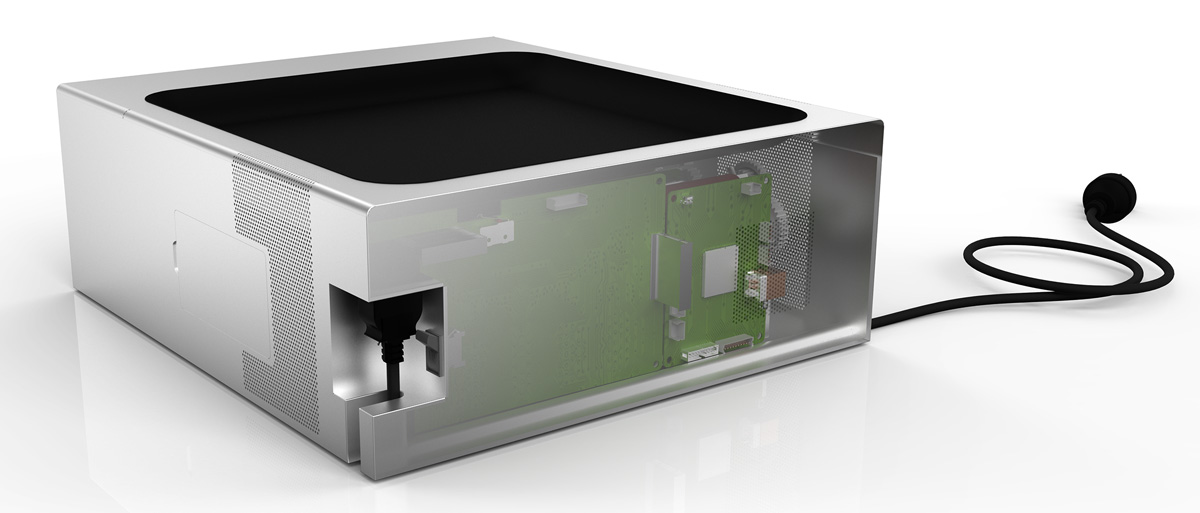
User scenario 3: A neutral shape to fit in every corner
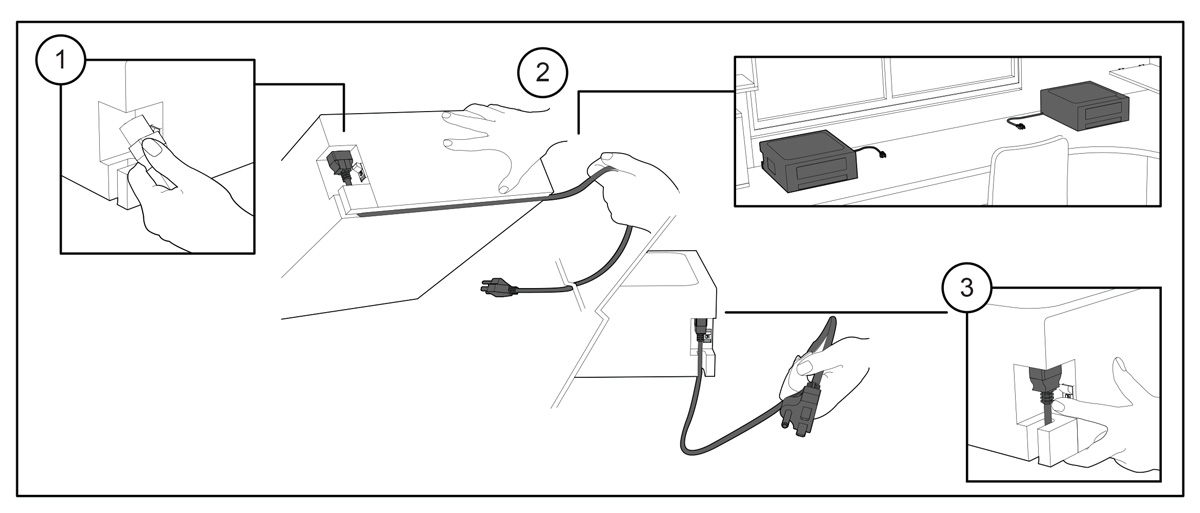
Another practical concern is the plug placement. Many printers cannot be set flush against a back or side surface because one or more of the power cables extend out from the device inconveniently.
The vertical port design with a slot at the bottom of the printer allows the cord to extend from the user’s choice of sides, encouraging a pleasing and convenient placement for most desk/home office environments.
Step 1: Plug in the power cord.
Step 2: Pull the cord down through the gap either left or right.
Step 3: Plug into the socket and turn on the switch.
Remark: The flexible cable channel allows the printer to be placed in every corner of the desk/ room.
User Scenario 4: A step-by-step design
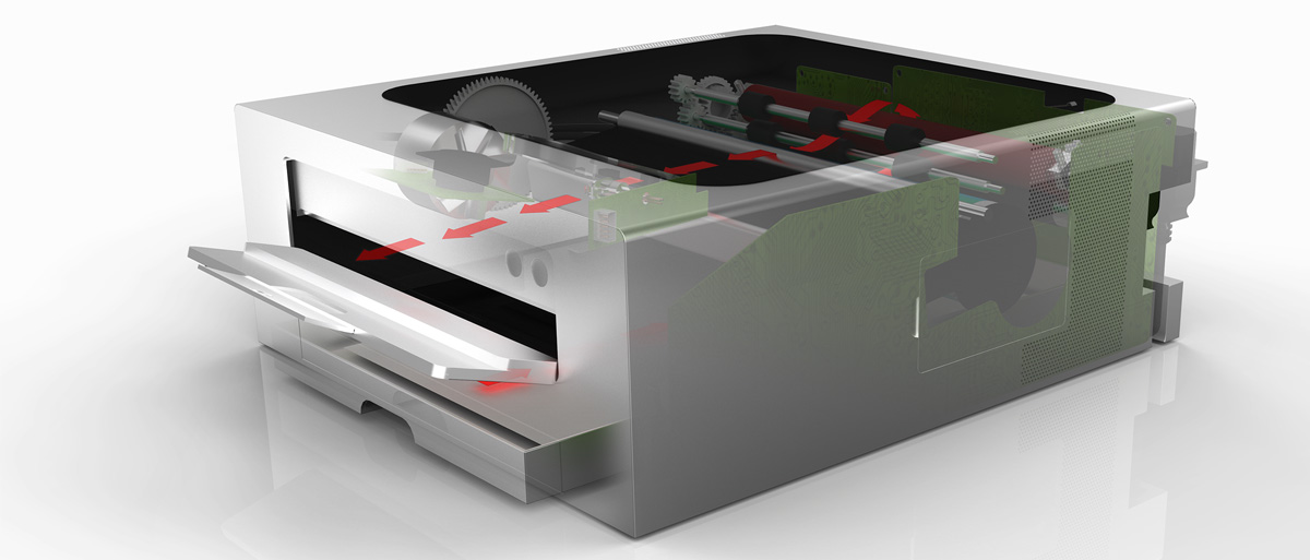
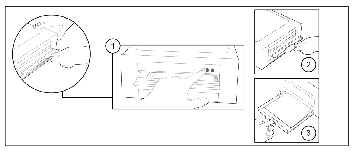
Many laser printers seem to malfunction when the output tray is not opened / extended before attempting to print, frustrating users and providing a
sub-optimal experience.
In this design, the power button cannot be reached without first opening the output tray, ensuring fewer ‘printer error’ messages and a smoother operation.
Step 1: Open the output tray for the control panel, press the ON/OFF button and double check the status light
Step 2: Pull out the output tray extender
Step 3: Insert paper into the paper tray and adjust the paper size guide
Remark: The control panel was designed behind the output tray in order to make sure the output tray is ready while it’s needed

